From Old to New:
Redesigning How Payments are Made
New to design & the company; As the sole-designer, I led the payment system redesign during a payment vendor migration.
ROLE
Lead UX Designer
DURATION
2022 - 2023
TEAM
+ 3 Developers
+ 1 Product Manager
+ Myself
From UX not being known to becoming wanted by c-suite
Crescent Bank was seeking a big transformation - switching payment providers, revamping their customer portal, and launching their first-ever mobile app.
Summary
As the lead UX designer, I was to make payments familiar and effortless. By collaborating with developers and stakeholders, we aimed to bring the project to life in just 16 weeks.
Impact
This project resulted in a 4.9 Apple Store rating, impacting over 10,000 customers, and became the catalyst to design-first thinking for future Crescent Bank projects.

THE STAKES
Ticking Clock and High Costs
Customer portal needs a makeover
Problem
Crescent’s current payment provider contract was coming to an end and their old customer portal needed a makeover.
Consequence
Extending the contract would cost $$$ and an old UI doesn’t sit well with today’s customers
Customers wanting an mobile app
Problem
Crescent’s customer experience was trailing behind their competitors
Consequence
Customers continued requesting a mobile app but none existed
To summarize this into a single goal:
Four Months to Shine
Retire the current customer portal within 4 months while designing for the future mobile experience
THE PROCESS
Designing Under Pressure
Your 4 months starts... now.
There was a lot of pressure for everyone to get this project moving and completed.
Stepping into the project, with a team that barely knew each other, multiple developers coming from college, and little to no UX research present, a starting point seemed like a needle in the haystack.
THE PROCESS
Discovering the Gaps
Before jumping into design
I needed to understand what was (and wasn’t) working. I started by meeting with product managers, who handed me a mix of PowerPoints, Word docs, and even some rough design attempts.
These became my first hints into what customers expected, and where the experience fell short.
Current shortcomings
To dig deeper, I sought after real customer interactions.
With a small, predefined budget, interviews were out of the question.
However, using the resources available, hours of phone call recordings revealed the biggest pain points:
Unknown Costs
Customers struggled to understand why they were charged certain amounts
Payment Confusion
Users knew they submitted payments but the internal systems did not sync up properly
Auto-pay Frustration
Customers forgetting auto-payments and accidentally making payments that couldn’t be cancelled
A quick deadline stopped me from creating user personas, yet, the call recordings revealed what I needed to empathize with the customers.
Understanding their frustrations and their needs guided me as I continued my research.
Investigating the competition
I wanted to grasp how those within the market built their payment flows, so our customers would have a more familiar flow to navigate.
So I conducted a competitive audit against 3 of our competitors and quickly found:
1
Universal payment flow
Every competitor used the same flow: 1) Select payment amount, method, and date; 2) Review your payment; 3) Payment confirmation
2
Broken down steps
On desktop, it was familiar to have the steps broken down instead of having all selections in a singular page.
3
Single page selection
When using mobile, it was common to see the payment options within one screen than to have them within individual pages as you would for desktop.
4
Navigate to customize
In order to customize one’s payment, the user would have to select the option they would like to update. Some options were prefilled, but seemed that the company decided what the value was filled with.
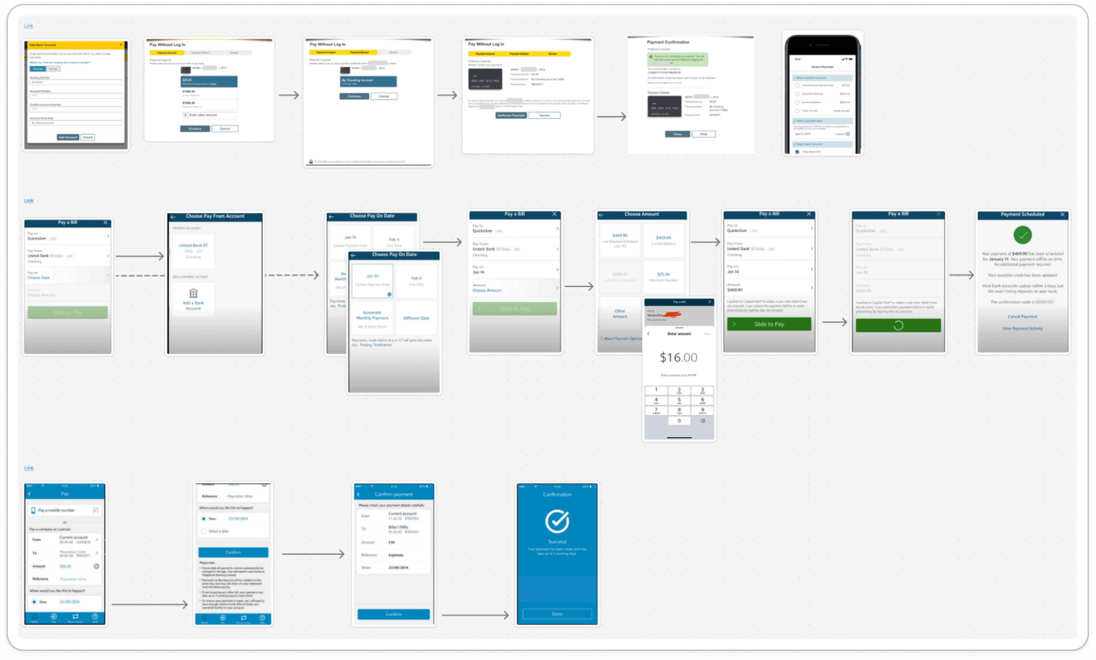
Competitive Analysis of Payment Flow
After gaining my insights, I started to work through the payment provider requirements.
While the core functionalities needed to reflect the old system, I had the freedom to enhance the UI—making it feel familiar, intuitive, and aligned with industry standards.
THE PROCESS
Mapping the Blueprint
Wireframing Straight to Hi-Fi
Normally, wireframing would be my go-to for exploring multiple design iterations. But with only a few weeks before presenting my first design iteration, speed was key.
With my research and a vendor-provided design system in place, I had a solid enough foundation to skip wireframes and jump straight into high-fidelity designs.
The design system ensured consistency, allowing me to iterate quickly before presenting to higher management.
THE PROCESS
Bringing It to Life
Get feedback, iterate often
I made it a priority to bring developers and stakeholders into the design process early and often.
Once a design flow was ready, I’d loop in the devs to confirm they were able to create what was in front of them. This helped me stay flexible, iterate faster, and avoid wasted work.
One example of feedback was when I was asked about the layout for input fields:
Constraints and workarounds
As the designs evolved, I found myself learning to work with real-world constraints.
New to Development
Some developers were still learning how to code
Workaround
More conversations were needed to clear up any missing items from the designs
Vendor Limits
Using vendor components limited customization
Workaround
Leaned heavily on the design system and other vendor provided pages
Implementing these workarounds helped simplify the design process.
Except, for when it didn’t...
Pairing up to make it happen
The design handoff wasn’t always smooth.
With junior developers on the team, annotations weren’t always enough. So I revisited my past and pair-programmed the front-end with them.
That not only ensured consistency, but it earned trust. My devs began feeling secure when I provided input. This also grew stakeholder confidence with every iteration they saw.
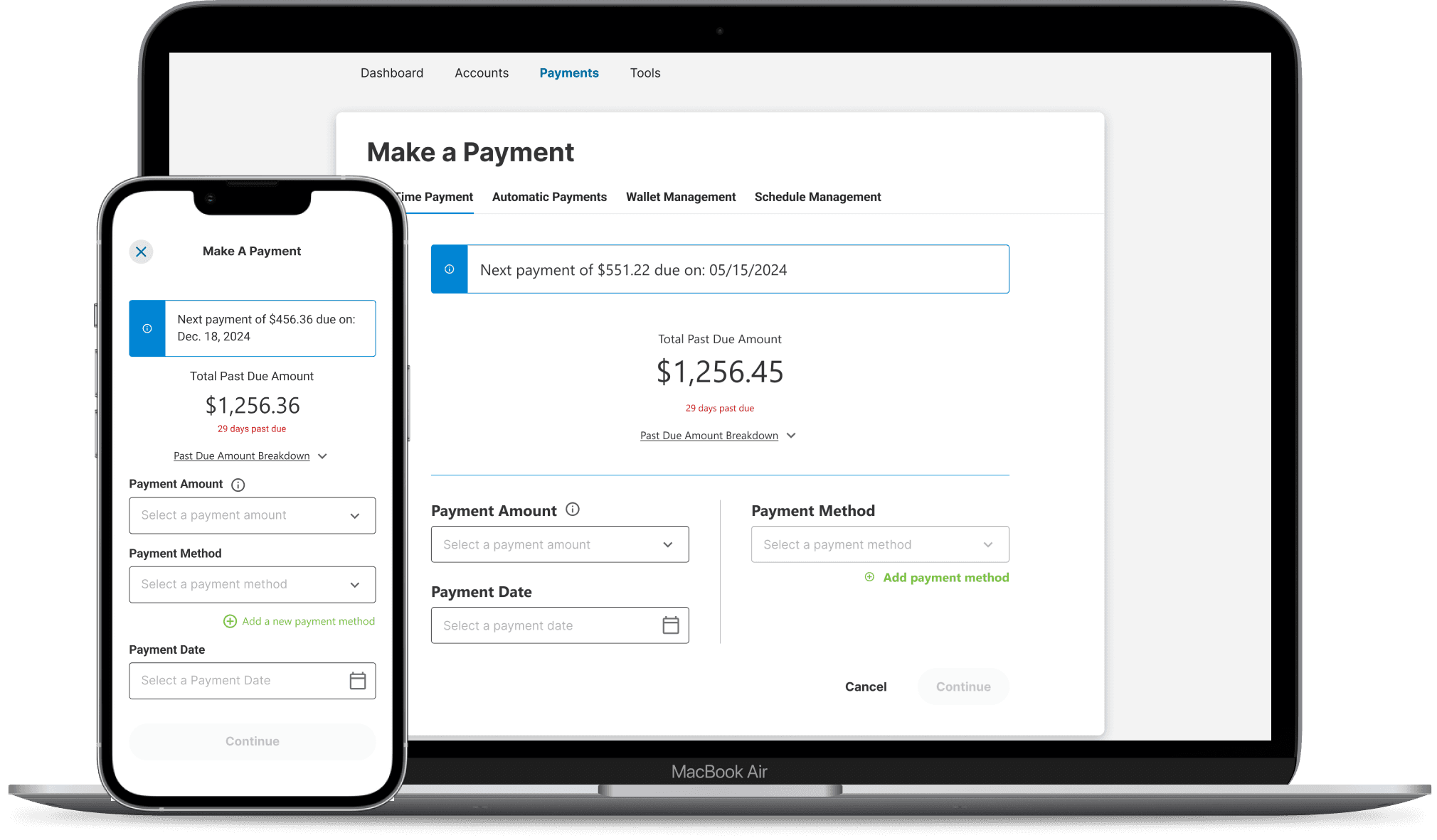
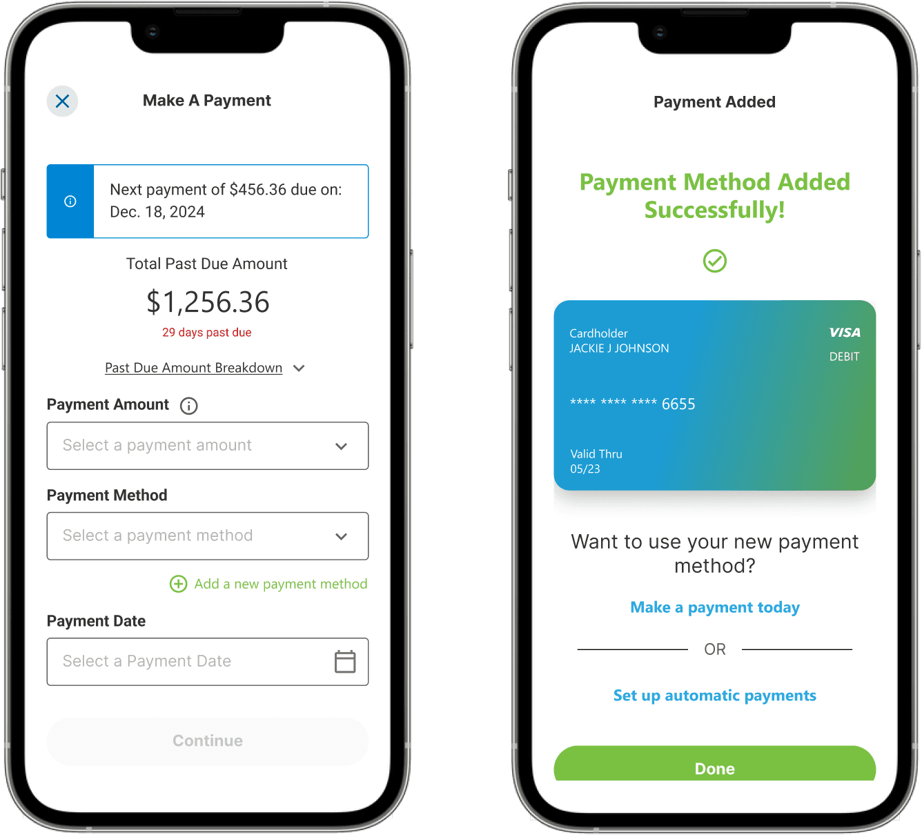
One-time Payment Page
THE OUTCOMES
From Idea to Impact
With designs finalized and devs locked in, we pushed the new payment experience live in Crescent’s first-ever mobile app and updated customer portal.
What customers are saying
App adoption
Apple Store rating
Added benefits
Not only did we obtain the results we were looking for from the release, there was impact beyond these:
Bringing UX into this project helped reshape how Crescent would build software. For the first time, building for the needs of the user wasn’t just an afterthought.
Stakeholders requested design be involved when kicking off projects, developers started inherently seeking for UI reviewal, and leadership saw the value of user-first thinking.
This project didn’t just solve a problem, it ignited a culture shift.
LEARNINGS
Retrospective
Here’s what I learned
I learned a lot and saw a culture shift for the first time - it was a fun, difficult, yet exciting experience. Working with a great team that sought to be humble and improve individually and collectively made the journey easier than it could have been.
1
The basics help bring simplicity
Despite having everything on the table, prepped and ready to go - with research and a design system made for me - there is much to be said about doing wireframes.
As fundamental as the step is, skipping it within a large-scale project like this wasn’t my brightest moment.
2
Grace, breathing room, and iterate
Speed is important, but room for creativity can help provide better outcomes.
In high-pressured projects, having grace on yourself and giving the necessary time to take breaks, and even extra time to design, can be just as valuable as speed. Then you can iterate on the designs that are best.
3
Responsive design for the win
Only accounting for one or two specific breakpoints does not account for the application being responsive. Applying these other breakpoints earlier on will bring less friction to the design sprint and less rework.

NEXT STEPS
Doors to new projects
So, what’s next?
Next steps would be to build a new application for Crescent’s customer service representatives to help them efficiently view data and simplify their tasks during phone calls.
