From Cluttered to Simplified: Solving a Historical Call Service Issue
ROLE
Lead UX Designer
DURATION
2024 - 2025
TEAM
+ Stakeholders
+ Product Manager
+ Myself
Solving a known issue prompts excitement!
This application exposed deep pain points and was anticipated to bring relief to daily problems faced by Crescent Bank's call service representatives.
Summary
Call service representatives needed a tool that would provide efficiency, simplicity, and relevance to their current phone call process. ConnectHub was to be just that: a way to simplify their daily tasks, streamline data, and reviewing account statuses quickly.
Impact
Representatives could save up to half their call time in doing less manual tasks, like searching for relevant data, by using ConnectHub instead of 5 other apps to complete these tasks.
THE FOUNDATION
Who are we doing this for and why?
After talking with some fellow employees, I was told of a problem being faced for a while that was persistent, and nothing has been done about it:
Our call service reps have so much to memorize and have so many screens pulled up all the time!
- Fellow Coworker
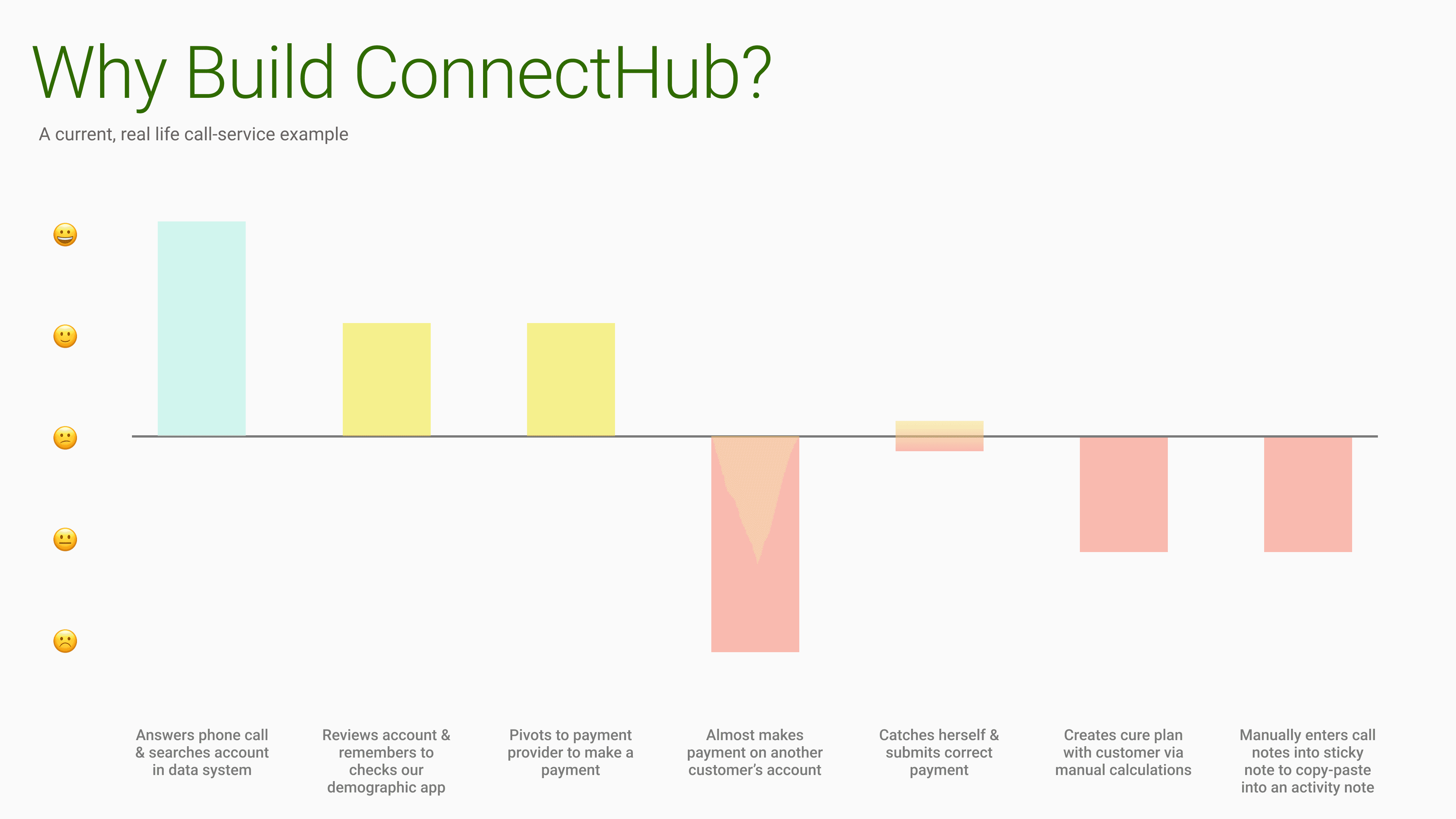
Taking the initiative, I started reviewing some call recordings to see if this were true. And it was a shocking surprise to what I saw.
Multiple apps open
Call service representatives had up to 5 applications and multiple browser tabs open at all times
Scattered data
The main system used was difficult to find data quickly during phone calls that required a lot of attention
Easy human-error
With so many attention-grabbers, making a mistake was bound to happen eventually
These were daily issues that have been dealt with for years!
After speaking with my manager about what was discovered, a project was born: ConnectHub.
THE STRATEGY
Thinking strategically
Initial steps
This project was not a small feat. So I needed to recruit business stakeholders, which was an easy sell since they knew the issues that were being had.
Then I decided to start my design process by including them early on, so they could see how design is needed within the company and how this project would help their employees.
THE PROCESS
Empathizing and grasping the problem
Doing some personal digging led me to reviewing more call recordings and conducting 4 interviews with call service representatives, here’s what was found:
1
Data scattered and unclear
Data need to be seen quicker, clearly, and to be more accessible during a call. Would be helpful it it was calculated for them too.
2
Information overload
A lot of verbiage, phrasing, and call flow was required to be known when speaking to customers and can be easily to forgotten.
3
Too many apps
Pivoting between 5-6 applications every call is not efficient, and causes more friction and less focus on customer.
4
Repetitious and manual tasks
As an example, copying and pasting templates from sticky notes on their desktop to then create call notes happened every call.
Defining our user group
After reviewing these details with the decision-making group, a resounding pause in the room, followed by, “something needs to be done”, brought the awareness needed to move forward.
Which led to making our persona for the group we were focusing on:
Building our problem statement
"Norman needs a way to easily access relevant data because he wants to efficiently use his time with each customer and improve his performance."
THE PROCESS
Defining what to include
Having a healthy mindset of determination to help these call service representatives, I led a few group discussions to define what our application would be and what metrics would determine its success. Here’s what we came up with:
Application goals
Audience
Specifically customer facing representatives
Customer service representatives
Collections representatives
Including in app
Guide call communication
Common/core tasks of agents
Show Days Past Due on payments during call (update it after actions taken)
Excluding in app
Specialty circumstances
Not replacing Main App core tasks
Application scope
Efficient communication
Agent is able to inform the customer quickly and efficiently of information and clear next steps for the customer to take within their current loan status
Information visibility
Information that is viable to the conversation is clearly visible and relevant to the current position within a call
Simplistic functionality
There is no longer a need to pivot between applications as often and features in the app will help simplify actions needed during or after a call
Application metrics
1
Reduction of handle time by 45% (handle time: time between start and disposition of call)
2
95% of activities are now done in app instead of Main app
3
Delinquency and agent performance is improved by 30%
Lastly, we ran a How Might We (HMW) exercise to throw out all possible ideas of what is needed and how it could be displayed for the representatives.
It was fun to assume and toss out ideas, but we needed to confirm these thoughts.
After interviewing some representatives, I used a prioritization matrix with the decision-making group to prioritize what was assumed correctly:
ITERATION 1
Designing a more practical experience
Wireframing
Efficiency, simplicity, and functionality were the key characteristics we were running after for this project. Crescent’s representatives were lacking this within their current experience, and we planned to give it them within ConnectHub.
First attempt at wireframing came with multiple iterations, landing with this design:
After attempting the design via digital wireframes, it didn’t pan out the way I expected. So I went back to the drawing board and sought out some ideas online.
My updated inspiration came from other SaaS applications that shared the same layout and desired needs: simplistic, clean, and data-driven design.
Here's what I found
1
Grouping data for easy reading
Data is meant to be easy to read at a glance. White space and containers would help with processing data quickly for understanding what’s happening on the account.
2
Visual hierarchy
Headers, sub-headers, font styling, and status badges would help provide distinction between importance and even severity of data contexts.
3
Easy navigation
Navigation should be intuitive with clear labeling so no guessing should take place as to where content should be.
Feedback given from future users
After speaking with those who would use the application, the feedback I received was: The dashboard is overwhelming and it's difficult to grasp right away what is being said about an account - especially during a call. We don't need charts during a call, just simple data.
ITERATION 2
Improving by feedback
Less visuals, more simplicity
Having visuals was unnecessary for the users. They were wanting simplicity and nothing else; "don't make me think" is essentially what they were saying. So here's what I came up with:
After receiving feedback again, this time we were closer to the final outcome! They enjoyed the simpler approach taken with the data, layout and structure of content, and the payment actions being as large as they are.
However, something was… off.
There was more to the puzzle
Although things felt right for the stakeholders, the navigation didn't seem to connect with the goal of a call service representative: quick and easy functionality, with clear navigation.
So I changed the approach of the application's flow to be based off the account that was pulled up instead of what type of call was being had (i.e. inbound/outbound). This allowed the representative more control to view relevant data instead of the application solely doing the work.
FINAL DESIGN
Coming to a conclusion
Making final adjustments
Coming to my last meeting with the stakeholders, I brought one last design approach that clearly displayed the data and simplified the actions that could be taken. After showing the new design, they were glad to accept this as the final result.
THE OUTCOMES
A wanted application from day one
Without fail, every time I spoke to a representative about this application, there was excitement in their voice and how much ConnectHub would make their daily tasks easier.
What reps were saying
Tasks simplified
App adoption rate
Extra improvements
With how frequently management was looped into the design process, they were able to see clearly the direction this application was going and how valuable of an asset it was to be.
Not only did call service representatives want this application, my team included wanted to build ConnectHub!
This project exposed daily issues and resolved them.
LEARNINGS
Retrospective
Here’s what I learned
Although there were many positives from this project, I still believe there were opportunities that should have been taken to improve my design process and how I approach designing.
1
Iterate more often
Depending on the stakeholder, sharing mid-fidelity wireframing would help bring visual clarity sooner instead of waiting till the hi-fidelity frames.
This can lead to deeper conversation instead of forcing the individual to think at a level they aren't comfortable with since they can't visualize what's in front of them.
2
Look for design inspiration early
More often than not, you do not have to reinvent the wheel when designing. There are many websites that provide clarity for any possible questions had or direction needed. (SaasInterface is a great example for SaaS apps)
3
It doesn't have to be perfect
Sometimes simply just getting something in front of stakeholders and getting feedback sooner than later is better than continuously iterating to get the "perfect design" or something that will be liked right away.